Welcome to Week 2 in my What to Wear series! This week, we will be diving into the ins and outs of color palettes and how to create them from scratch. If you missed last week’s overview, I recommend hopping over and checking that out here. If you’re good and caught up, let’s go ahead and get started!
When I was first starting off in my photography journey, I never gave color much thought. Actually, I never gave my clients’ wardrobes much thought, period. I simply would show up to the session, cross my fingers that my clients had better taste in clothing than I did, and go from there. Looking through my portfolio, I never could figure out why some sessions naturally seemed to look better on film than others, or why certain ones seemed to fall short of creating the mood I had been going for. Some families looked cohesive and well put together, and other ones…didn’t. I couldn’t put my finger on what was missing; I just knew that something wasn’t there.
The more I studied, the more I learned the importance that color can play in a photography session. Color can help trigger very particular moods and associations. Don’t believe me? Let’s try it. What emotions do you typically associate with the color red? Love? Sexiness? What about black? Did you think power? Mysteriousness? Formality? And finally, how about the color yellow? Happiness? Friendliness? Laying it out like this, it may seem obvious, but the colors you select help convey the message you want to portray.
Finding Your Best Colors
While certain colors may be universal in conveying particular moods, not all tones are flattering to an individuals’ skin, hair or eye color. If you have ever had trouble finding colors that flatter you individually, I recommend trying a few of the following techniques (taken from David Zyla’s approach, “Color Your Style.” You can read more here).
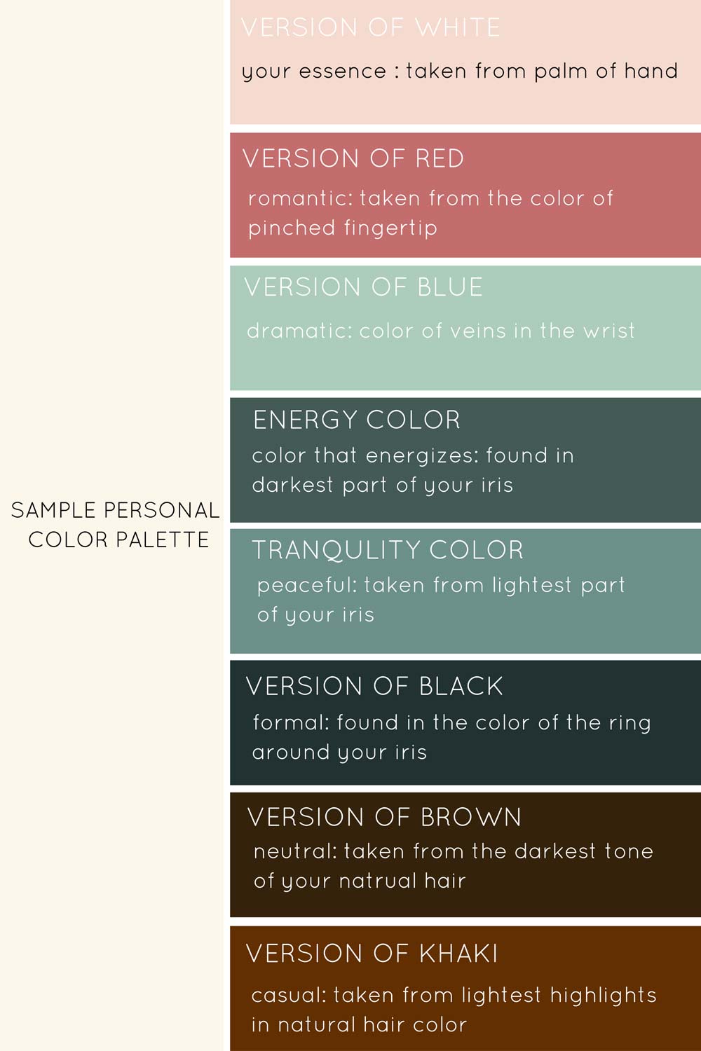
To find your most flattering version of white, inspect the palm of your hand and choose the color that best harmonizes those tones
To find your most flattering version of red, check for the darkest tone present when you pinch the tip of your finger; also the color present in your cheeks when you blush or are flushed
To find your most flattering pop of bright color, inspect the tones in the veins of your wrist
To find your most flattering version of black, inspect the color of the dark ring around the iris of your eye
To find your most flattering version of brown, select the darkest tone found in your natural hair color
To find your most flattering version of khaki, select the lightest tone found in the highlights of your natural hair color
The following is a chart that I made from my own personal colors–The funny thing that I found by putting this together is that many of these colors are ones that I have always been naturally drawn to.
Once you have found your own flattering tones, you can start to put together your own personal palette for particular events (ie. your best formal color for a corporate headshot, or your best pop of color to convey a sense of playfulness). One last note on this topic: I have personally found that once I discovered my best shades, complimentary tones that hold many of the same characteristics have been equally flattering on me.
Developing a Color Palette For Your Family
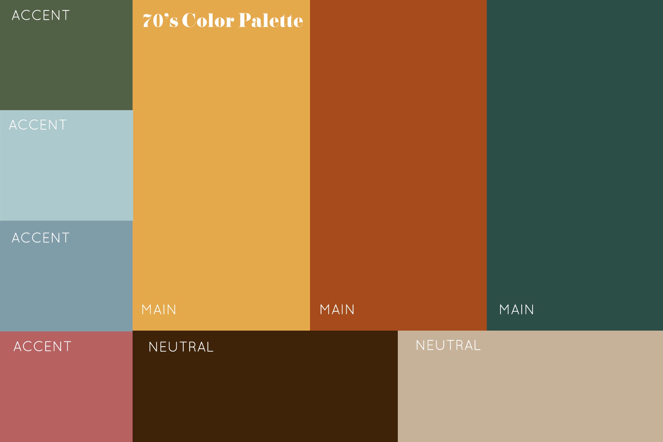
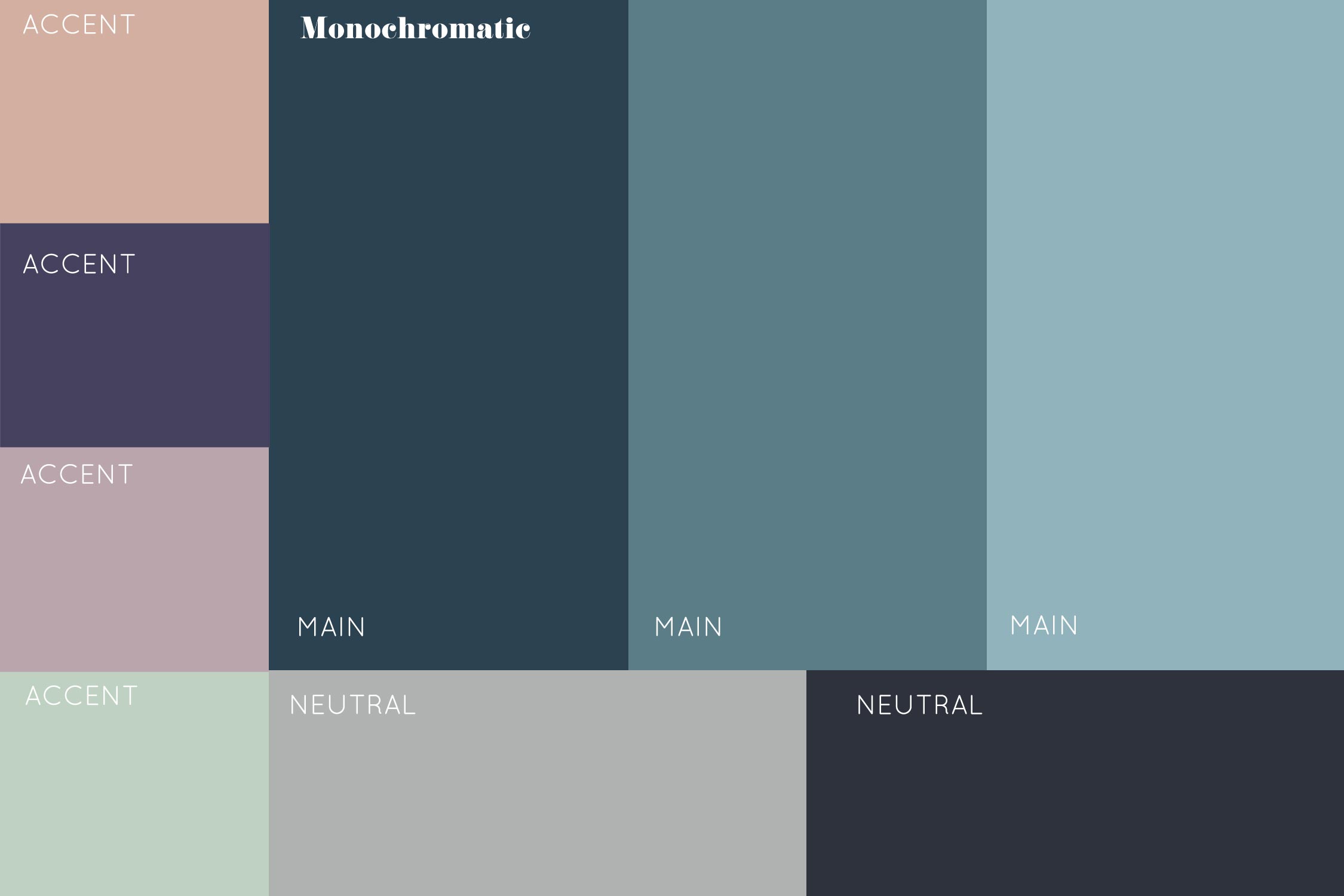
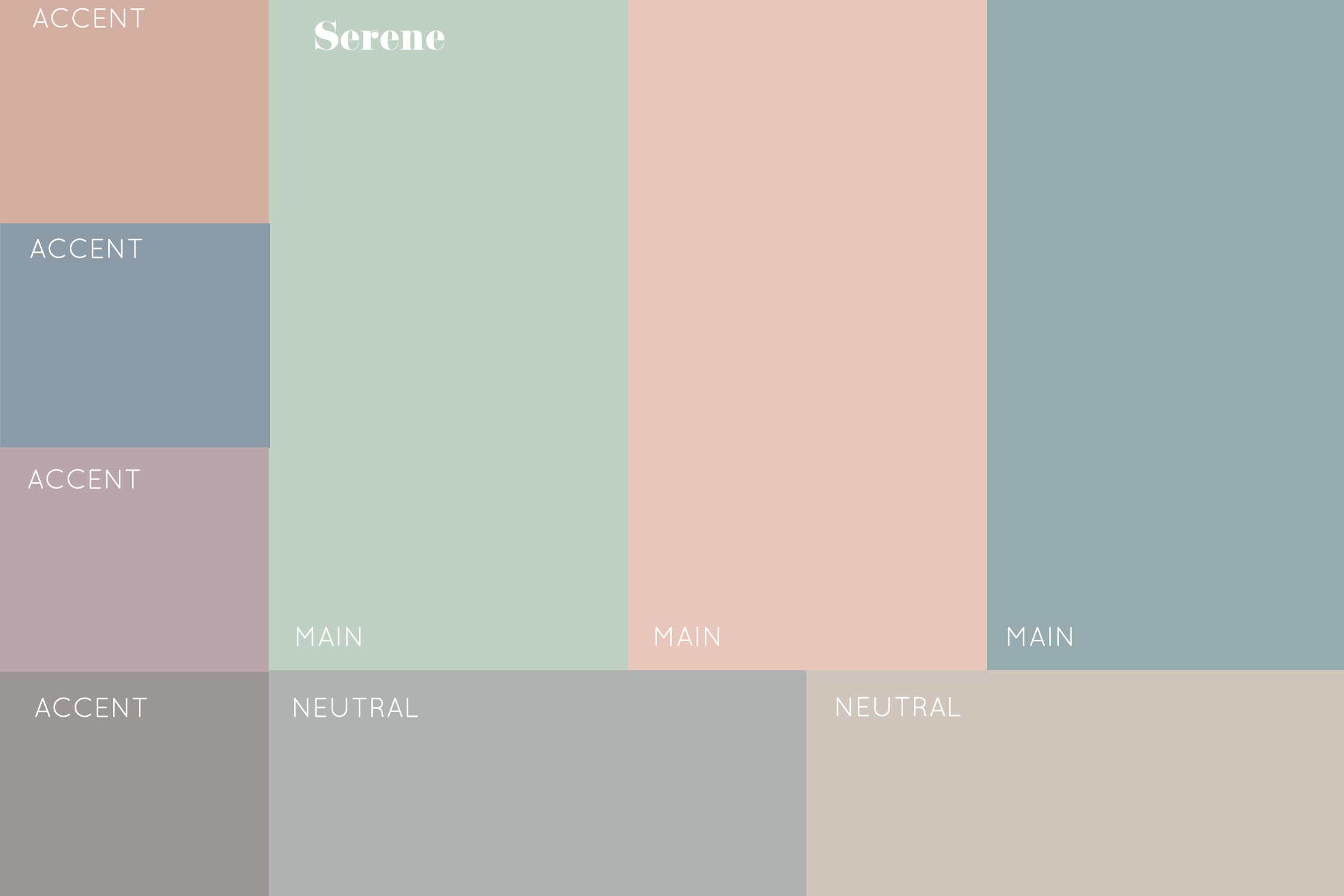
Creating color palettes is one of my favorite approaches to selecting the perfect outfits for your family. To create a palette, select anywhere from 6-12 shades that work well together and reflect the style and mood you are going for.
Main Colors: I always recommend starting by deciding what your 2-3 main shades of color will be. These colors should always signify the concept you are going for. For example, if a high school senior wants a boho session inspired by the 1970s, I would recommend selecting shades of dark orange or mustard yellow to begin with. If an expecting momma wants a peaceful, serene feel to her photo shoot, I would recommend selecting light shades of blues, purples or pinks with gray undertones. The possibilities are endless–the important thing is selecting the perfect foundational colors that will convey the message you want to portray in your images, but are also tones that you feel confident wearing.
Accent Colors: These are tones included that will help add variety to your outfit without taking over. I always recommend selecting between 2-4 accent colors that can be included in accessories, smaller articles of clothing (like sweaters) or in small prints on the clothing.
Neutral Colors: These colors help support and balance out the other shades. Choose these tones last, as it often helps to see your overall palette first to know whether to include warm or cool neutrals. These are great filler pieces that round out the overall look. Please note that generally all shades of denim tend to act as a neutral, although certain shades can really come out as a strong blue on camera. In these instances, be sure to include the denim as a color rather than a neutral.
The following are just a few random sample palettes I put together. Please note that while I included lots of color options within each palette, I would not feel obligated to utilize every single color. These are mostly used as as starting point for inspiration, and are especially useful to draw from for extended family sessions:
Putting it All Together
Once you have selected your favorite color palette to work with, the fun begins. Many clients will use this opportunity to go shopping for the perfect outfits, although we can nearly always find things that are already in your wardrobe that will work. Keeping your color palette in mind, start by selecting your main pieces. For family wardrobes, I typically will start with the mother’s outfit. One of my favorite techniques is finding a beautiful dress for Mom to wear–this achieves several things: the style of dress can set the mood, lay a strong foundation of color to build off of, and provide an anchor for the other outfits to balance off of. However, if the mother would prefer to wear a blouse, I make sure to select a top in one of the main colors, and usually balance it out with a neutral on bottom. If she is wearing a dark top, I make sure to pair it with a light neutral; if it’s a light top, I will tend to stick with mid to darker neutral.
Next, I like to style Dad’s outfit. Most dads feel comfortable wearing button down shirts or nice t-shirts, so typically those are my go to’s. These shirts are easy to find in solid colors, so I will often choose a top in another main color, paired with a pair of neutral pants or shorts. As I am formulating these outfits, I always try to keep balance in mind. I always avoid having a solid block of similar tones on either the top or bottom. If the mother is wearing dark on bottom, I will be sure to break up that line of dark tones by placing dad in a lighter color of pants. The same holds true for tops. I am always looking for ways to provide balance to the overall image, to keep the viewer’s eye wandering around the entire photograph for as long as possible.
Finally, I balance out the look by choosing the children’s outfits. If the kids are small, I love to incorporate light patterns into their clothing. Discreet stripes and floral patterns are beautiful on small pieces of clothing, and it’s a nice way to incorporate pops of accent colors without going overboard. It’s also nice to incorporate cute onesies in soft neutrals to balance out some of the main colors. The same rules apply to selecting children’s outfits: always seek balance with the established outfits and colors.
A Few Last Things to Consider
One last tip from a photographer’s perspective: please note that if you are wearing a bold color close to your face, especially one in the neon family, these shades have a tendency of reflecting back up onto your skin and causing a color cast. Just know that when you wear some of these colors, it may add additional time to when you receive your images, as I will be busy editing those out, haha!
And that’s it for colors! I hope this has given you a little food for thought when selecting your outfits. For further reading on this topic, I recommend checking out David Zyla’s Book “Color Your Style.” Also, if you would like inspiration for sample color palettes, I have created a board with some of my own personal favorites here, or check out some of these pretty compilations to fit a wide variety of moods! Join me next week as we dive into the next round of this series!